Site hosted by Angelfire.com: Build your free website today!

Web SiteHOME | CSS | TABLES| IMAGES | TYPOGRAPHY| LAYOUT| DEVICES| FORMS| COLOR THEORY | DREAMWEAVER FEATURES | RESOURCES| ACCESSIBILITY: Helpful Hints & Examples of Luxury Sites

HOME | CSS | TABLES| IMAGES | TYPOGRAPHY| LAYOUT| DEVICES| FORMS| COLOR THEORY | DREAMWEAVER FEATURES | RESOURCES| ACCESSIBILITY|HOME | CSS | TABLES| IMAGES | TYPOGRAPHY| LAYOUT| DEVICES| FORMS| COLOR THEORY | DREAMWEAVER FEATURES | RESOURCES| ACCESSIBILITY|HOME | CSS | TABLES| IMAGES | TYPOGRAPHY| LAYOUT| DEVICES| FORMS| COLOR THEORY | DREAMWEAVER FEATURES | RESOURCES| ACCESSIBILITY|HOME | CSS | TABLES| IMAGES | TYPOGRAPHY| LAYOUT| DEVICES| FORMS| COLOR THEORY | DREAMWEAVER FEATURES | RESOURCES| ACCESSIBILITY|HOME | CSS | TABLES| IMAGES | TYPOGRAPHY| LAYOUT| DEVICES| FORMS| COLOR THEORY | DREAMWEAVER FEATURES | RESOURCES| ACCESSIBILITY|HOME | CSS | TABLES| IMAGES | TYPOGRAPHY| LAYOUT| DEVICES| FORMS| COLOR THEORY | DREAMWEAVER FEATURES | RESOURCES| ACCESSIBILITY|HOME | CSS | TABLES| IMAGES | TYPOGRAPHY| LAYOUT| DEVICES| FORMS| COLOR THEORY | DREAMWEAVER FEATURES | RESOURCES| ACCESSIBILITY|

FORMS|HOME | CSS | TABLES| IMAGES | TYPOGRAPHY| LAYOUT| DEVICES| FORMS| COLOR THEORY | DREAMWEAVER FEATURES | RESOURCES| ACCESSIBILITY|HOME | CSS | TABLES| IMAGES | TYPOGRAPHY| LAYOUT| DEVICES| FORMS| COLOR THEORY | DREAMWEAVER FEATURES | RESOURCES| ACCESSIBILITY|HOME | CSS | TABLES| IMAGES | TYPOGRAPHY| LAYOUT| DEVICES| FORMS| COLOR THEORY | DREAMWEAVER FEATURES | RESOURCES| ACCESSIBILITY


Review Questions/Answers

Answers to Review Questions in EWB:

1. What are client success criteria/why important?

Answer: You must know why the client's audience is going to the website in order to make it meet their needs. Think about what kind of computer the audience has, what speed Internet, etc. Remember most websites are for promoting/marketing products & services.

3. Why are these elements important? Answer: EMPHASIS...draws attention to the main points, helps guide the viewer through the site. CONTRAST...enhances visual appeal, makes it easy to read, prevents boredom. BALANCE...gives a sense of organization and rationality, is easy on the eye, soothing. REPETITION...reinforces the feeling of coherence, repeat colors, shapes, placement to reinforce the theme of the site. VISUAL DIRECTION...alignment gives a feeling of harmony and order to the site; also helps the reader see and understand relationships in content (lists, etc.).

4. Why use a logo on every page? Answer: People surf and may not remember what site they're on without the logo. The logo or the product image should be the most important part of a page, followed by content or navigation.


ThreeHOME | CSS | TABLES| IMAGES | TYPOGRAPHY| LAYOUT| DEVICES| FORMS| COLOR THEORY | DREAMWEAVER FEATURES | RESOURCES| ACCESSIBILITY Tools:

•Tracing Image: Image that can be placed in the background of your page to serve as a guide as you build your site. Will not be visible to the viewer.

•AP Div: Like a table cell but unconnected to any framework. AP Div's are nice because you can put them anywhere on the page.

•Table: Helps you organize your page and line up text and images.


WWW.CHANEL.COM

http://www.chanel.com/

Chanel has a startling HOME | CSS | TABLES| IMAGES | TYPOGRAPHY| LAYOUT| DEVICES| FORMS| COLOR THEORY | DREAMWEAVER FEATURES | RESOURCES| ACCESSIBILITYpage with a gorgeous model and flash sequence that gives you the feeling of being on a movie set. Everything loads quickly and it's an easily accessible site.

The design of the site most closely fits the "No Interface, Just Whitespace" pattern of design described in Ch. 2 of EWB.HOME | CSS | TABLES| IMAGES | TYPOGRAPHY| LAYOUT| DEVICES| FORMS| COLOR THEORY | DREAMWEAVER FEATURES | RESOURCES| ACCESSIBILITYdominate; there is very little text, mainly just links. It appears to be a Flash website.

Chanel web site

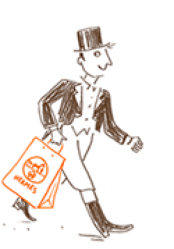
WWW.HERMES.COM

http://www.hermes.com/

Hermes makes beautiful scarves and their name represents "chic." Their site is stylish and playful, but it takes quite a while for the slide shows to load. THeHOME | CSS | TABLES| IMAGES | TYPOGRAPHY| LAYOUT| DEVICES| FORMS| COLOR THEORY | DREAMWEAVER FEATURES | RESOURCES| ACCESSIBILITY that most closely corresponds to this site is the "Side Navigation" though the choices are floating in white space next to a central image. Appears to be using Flash throughout.

Hermes shopper

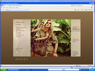
WWW.GUCCI.COM

http://www.gucci.com/

Gucci is known for their daring styles, beautiful colors and fabrics. Their site uses strong colors and dramatic models. The logo appears to be gold lettering. Could be classified as an "Unconventional Style" with navigation type links on either side of a central image. Based on Flash.

Gucci web site


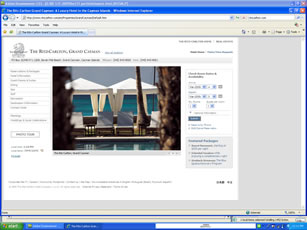
WWW.RITZCARLTON.COM

http://www.ritzcarlton.com

The Ritz Carlton is where I would stay if I could afford any of the brands shown in these websites! Their site is complicated but very efficient, with quick transitions and easy-to-read text. TheHOME | CSS | TABLES| IMAGES | TYPOGRAPHY| LAYOUT| DEVICES| FORMS| COLOR THEORY | DREAMWEAVER FEATURES | RESOURCES| ACCESSIBILITY resembles the "Left Justified" L design with navigation across the top and down the left side. More links on the right. Based on Flash.

Ritz Carlton Hotel


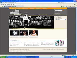
WWW.CHICAGOSHAKES.COM

http://www.chicagoshakes.com/

For me, tickets to the Shakespeare theater in Chicago are the height of luxury. The website is user-friendly, with quick loading information about the plays and how to order tickets. TheHOME | CSS | TABLES| IMAGES | TYPOGRAPHY| LAYOUT| DEVICES| FORMS| COLOR THEORY | DREAMWEAVER FEATURES | RESOURCES| ACCESSIBILITY is "Unconventional" with links in the middle of the page. Seems to useHOME | CSS | TABLES| IMAGES | TYPOGRAPHY| LAYOUT| DEVICES| FORMS| COLOR THEORY | DREAMWEAVER FEATURES | RESOURCES| ACCESSIBILITY to organize information andHOME | CSS | TABLES| IMAGES | TYPOGRAPHY| LAYOUT| DEVICES| FORMS| COLOR THEORY | DREAMWEAVER FEATURES | RESOURCES| ACCESSIBILITYon the page.

Chicago Shakespeare Theater